Graphic Design
When we were asked to reimagine a law office and notary public, we designed the interior architecture, we selected the furniture, the art and the accessories of the space. So when we were asked to design the brand identity of the firm we saw this as an opportunity to create another element that would further compliment the project and emphasise the main design ideas of the interior space.
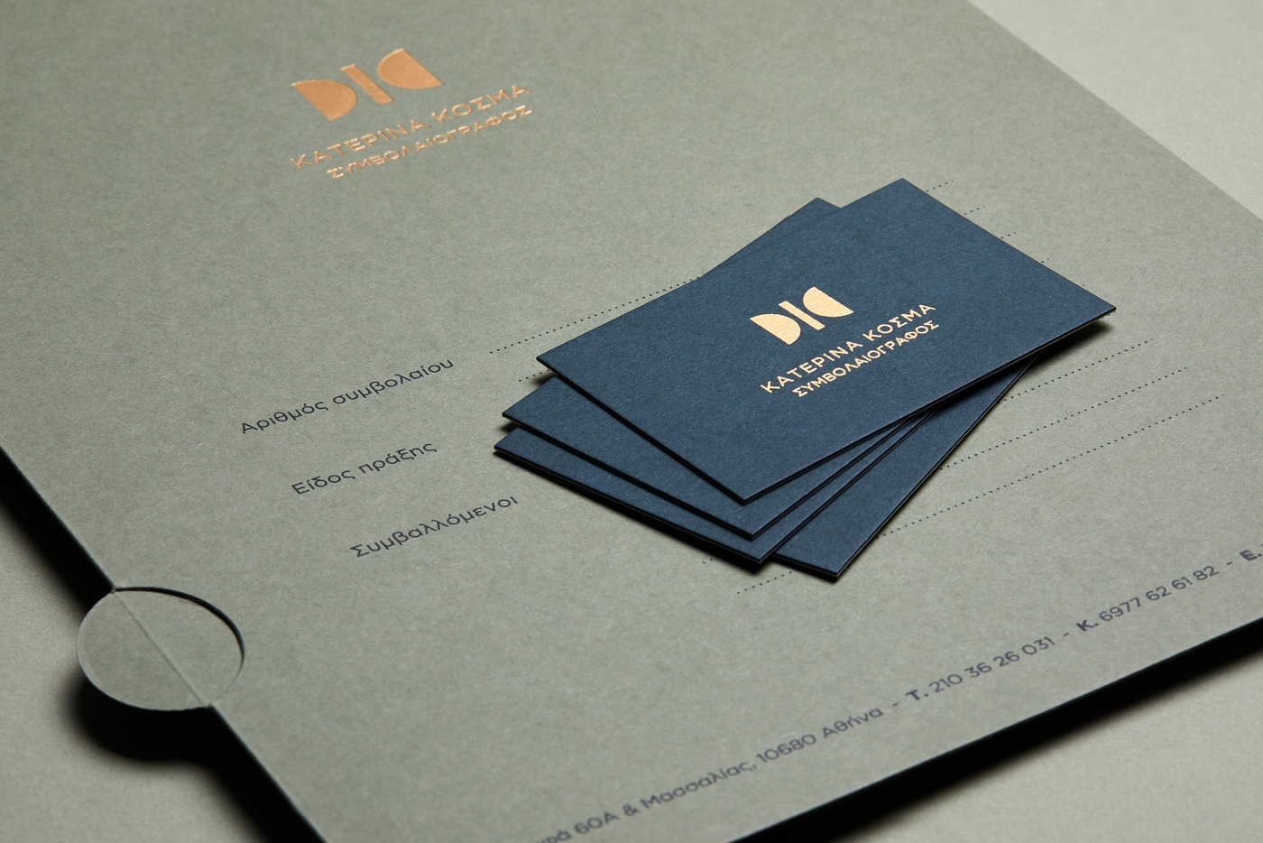
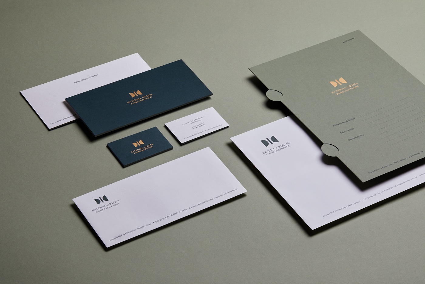
The logo is based on the initials of the name of the owner, Katerina Kosma. Two semicircles and one line, define through negative space the two K's of the name of the owner.
Simplicity, geometry and color, are some of the elements shared between the architecture and the graphic design identity, thus strengthening the relationship of the two.
photographed by Giorgos Vitsaropoulos